Overview

Is your business looking for the right identity to help increase attention and purpose by attracting colleagues and ideal customers?

My name is Jon and this is my online portfolio. I've been a freelance graphic designer for 5 years. I have many different instruments, but specialize in designing brand identities. Keep scrolling below to see all of my creativity.
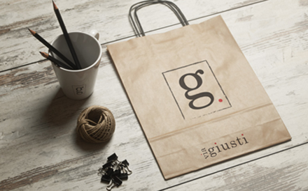
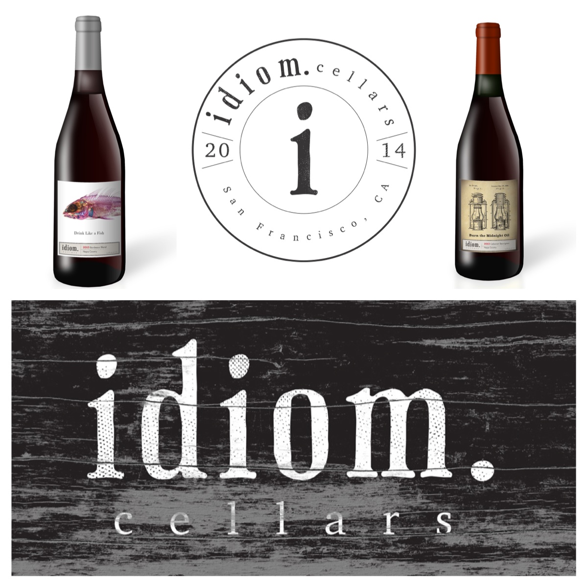
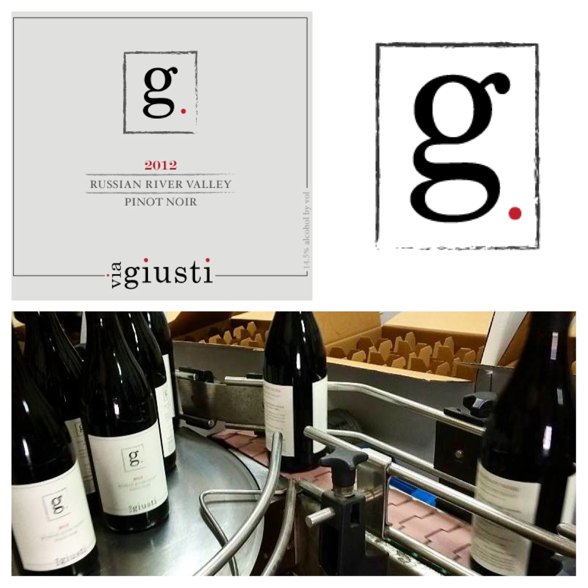
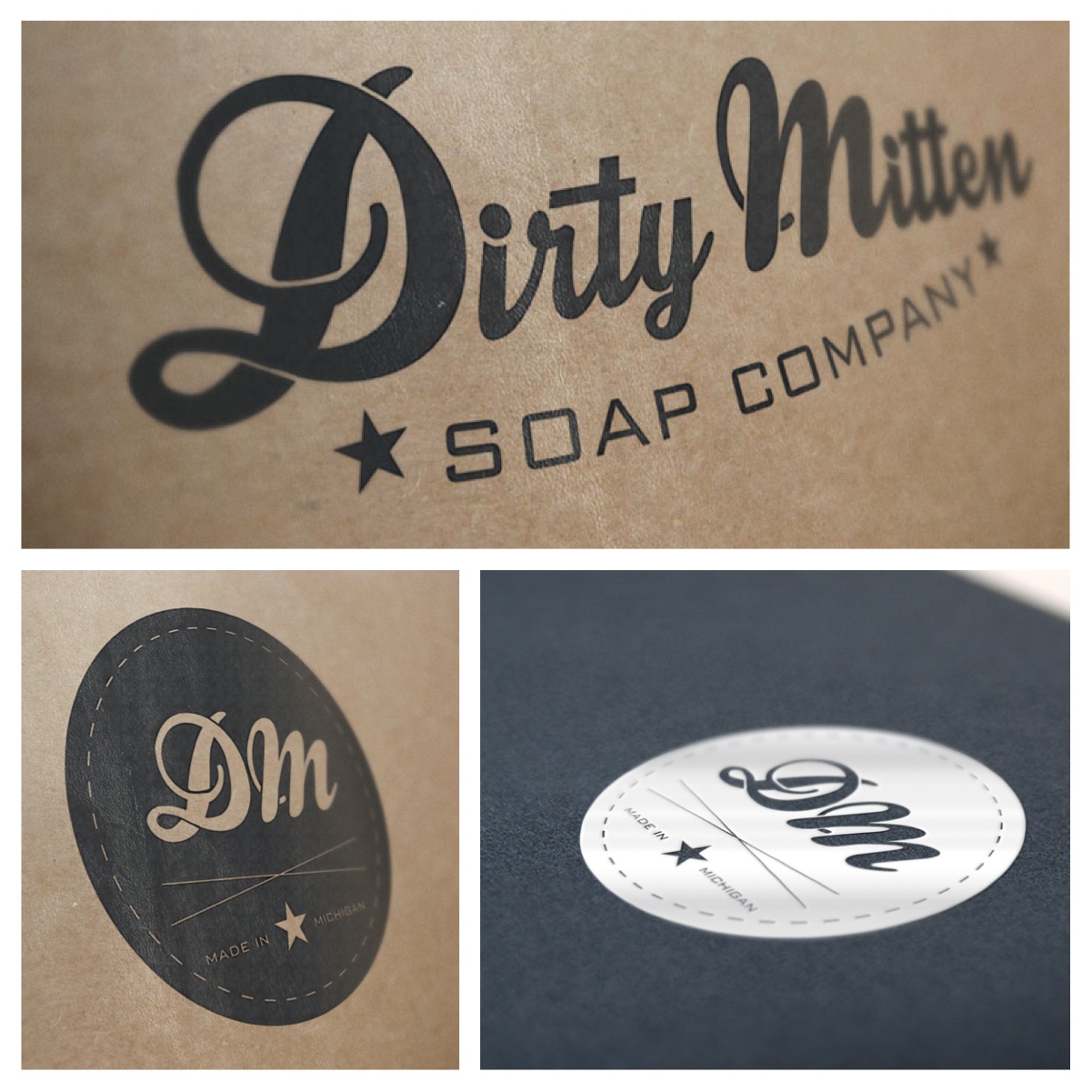
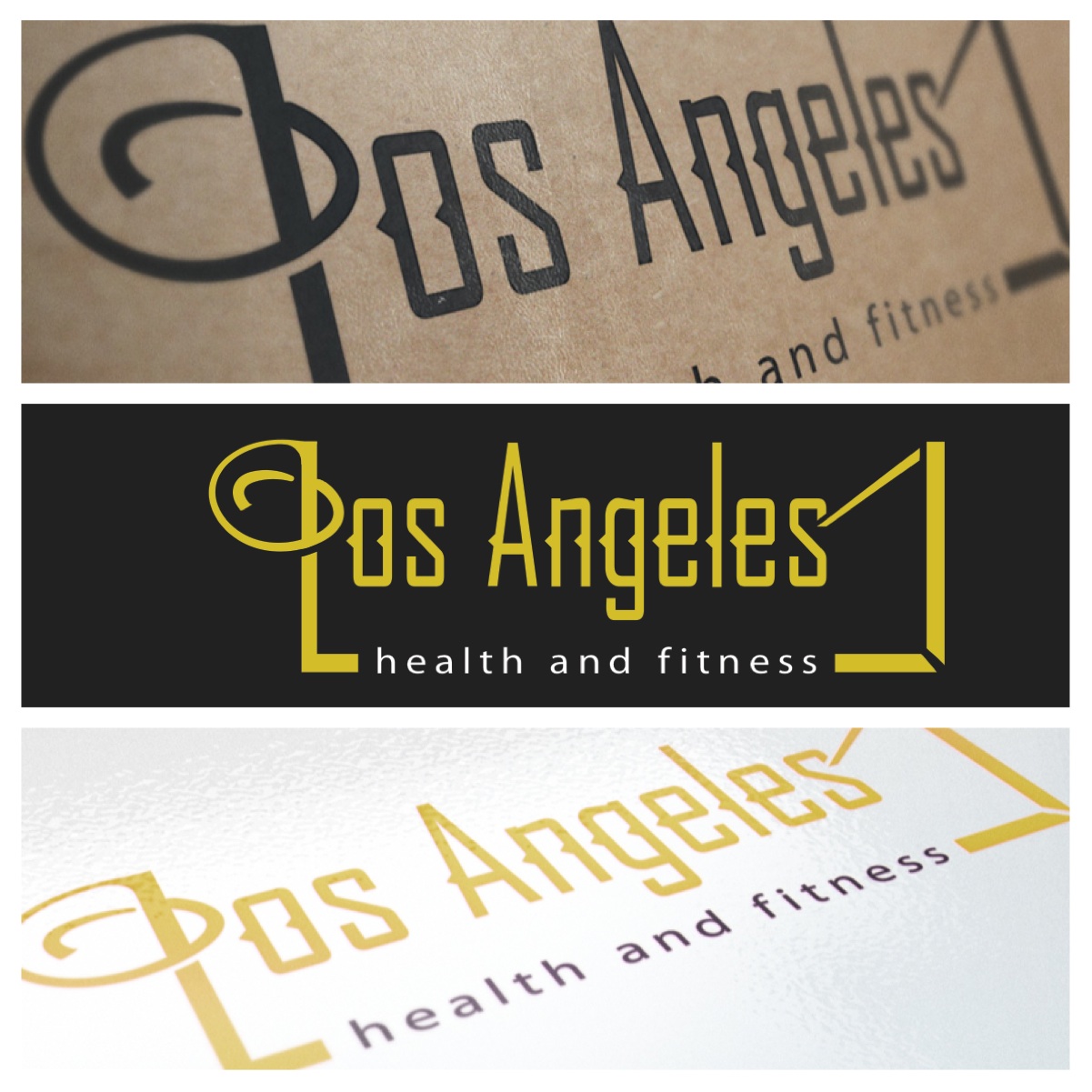
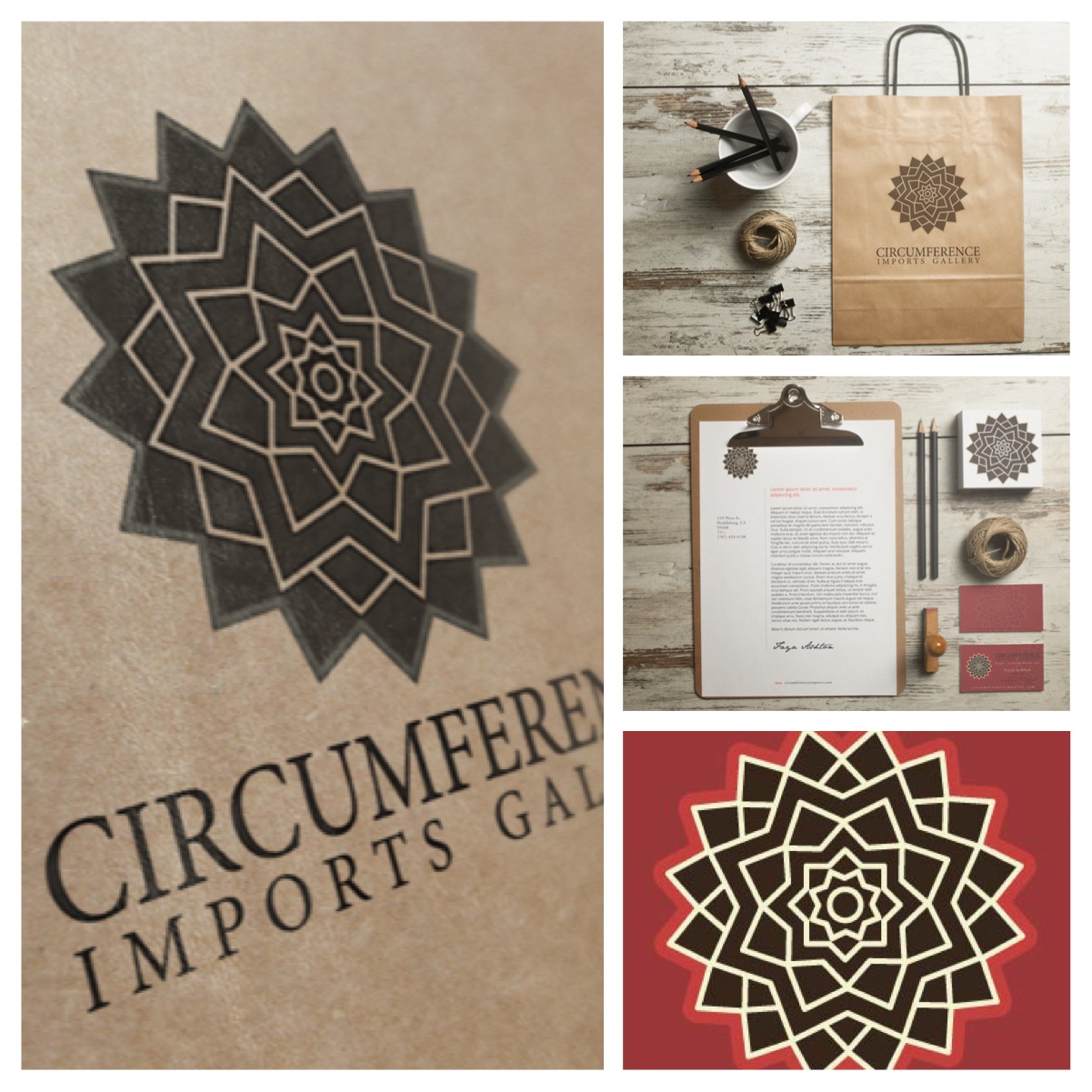
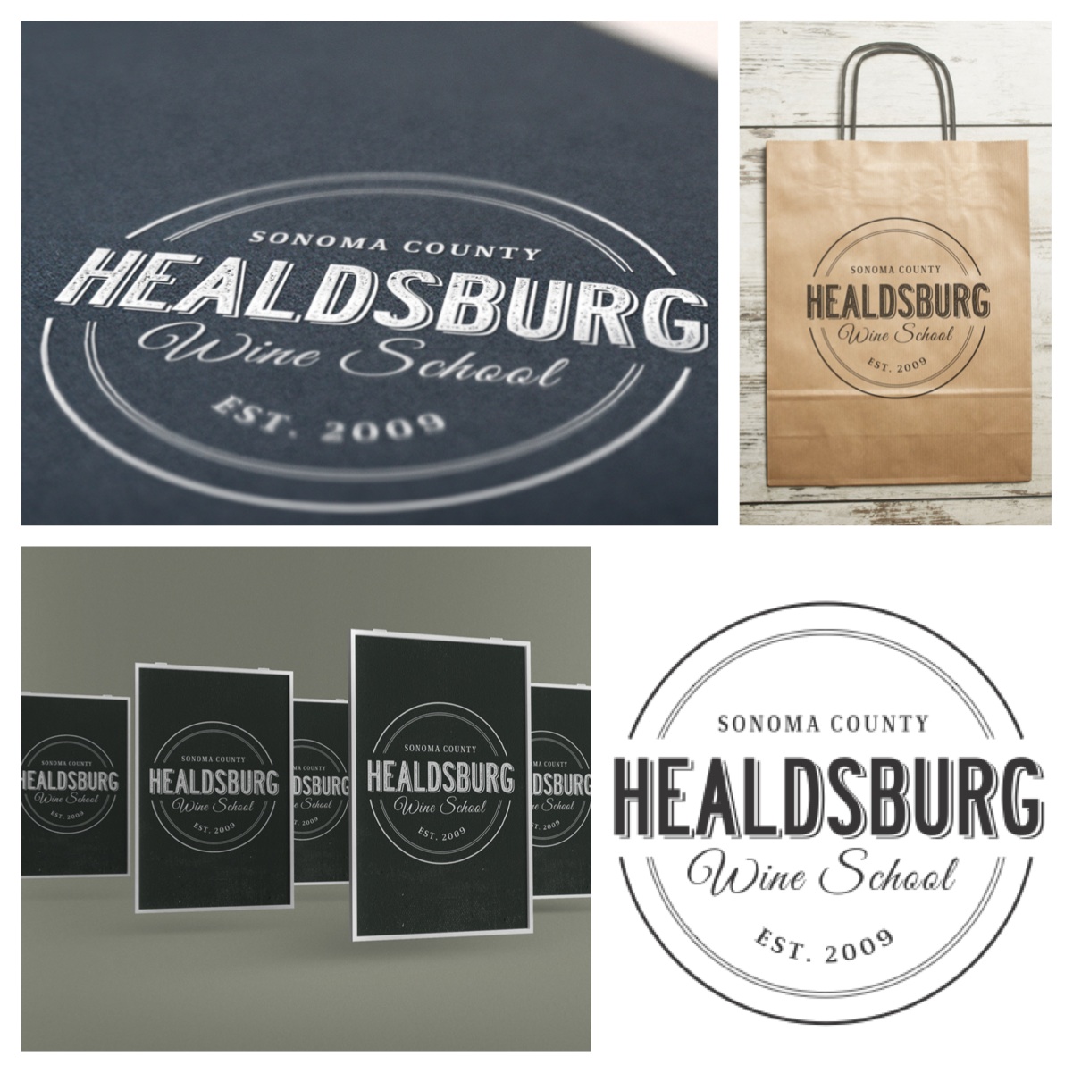
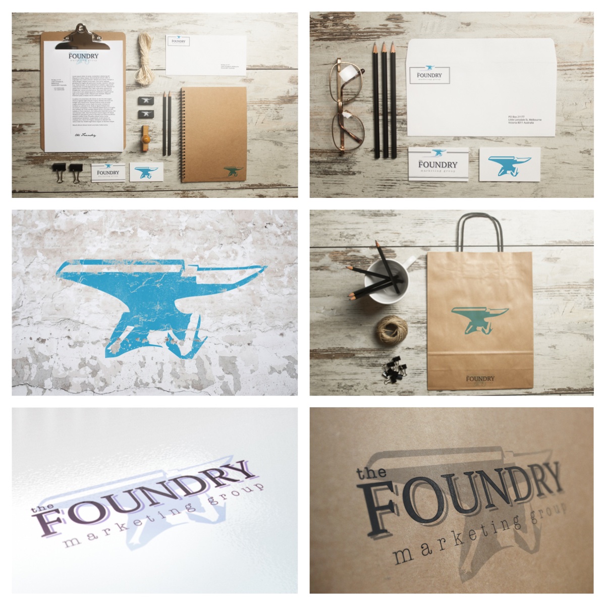
  • Creating Brands

    It's more than just logo design...it's a consistent look and feel that builds a strong cohesive brand.
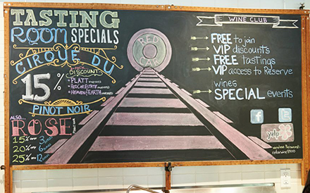
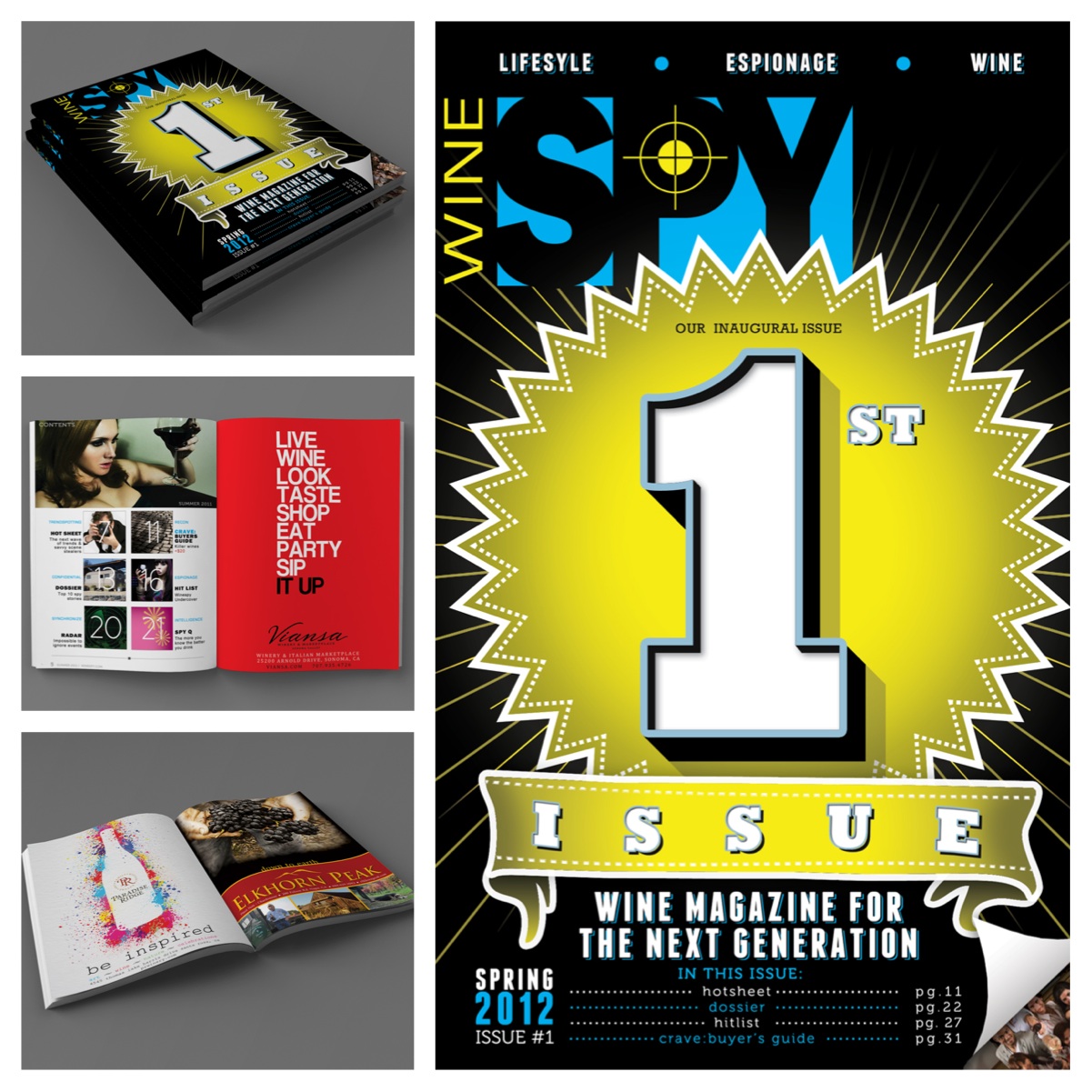
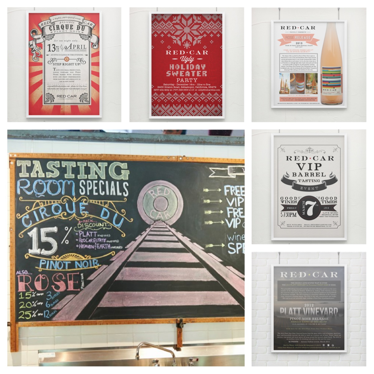
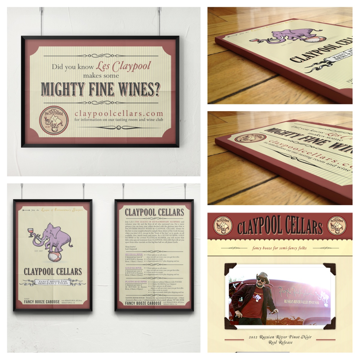
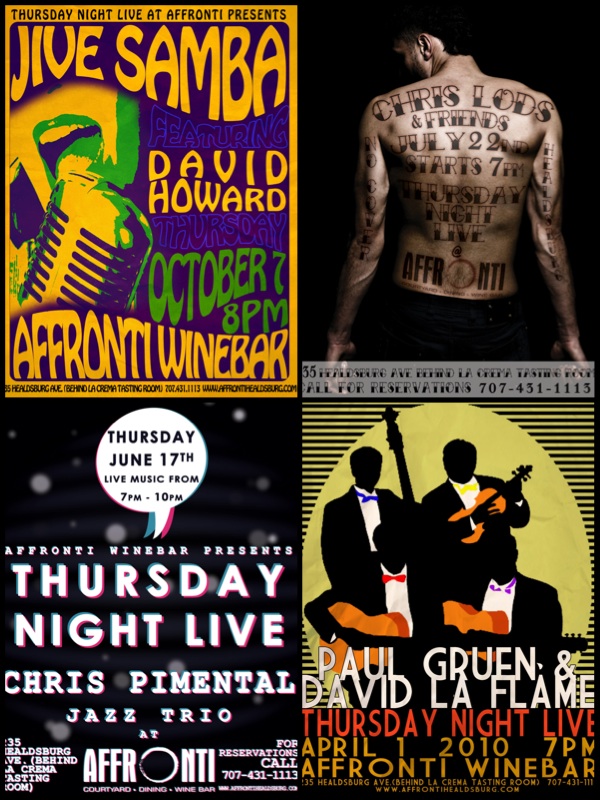
  • Marketing

    Advertisements turn on your brain. Since our lives are over-stimulated with ads, we need to be selective. Ads that create a visual and emotional connection will be memorable and help get the attention you deserve.
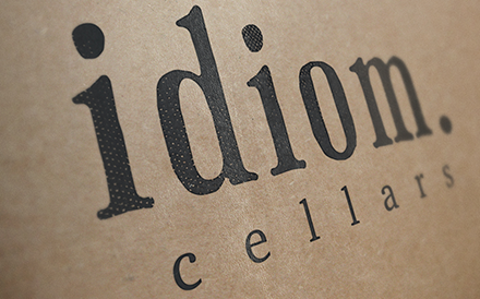
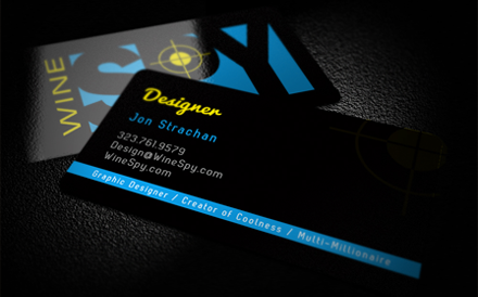
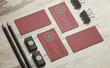
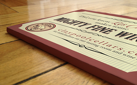
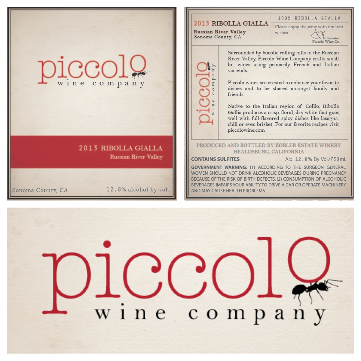
  • Printing

    You can print just about anything! T-shirts, Wine labels, Posters, Wedding invites, Stationary, Stickers, Maps, Press Release Newsletters, Business cards...I think you get the idea!

The Team

A little about me.

I grew up in the suburbs of Detroit Michigan. I played hockey, watched too much MTV, Ren & Stimpy, and playing Nintendo (NES) for hours without even blinking. When I was a child one of my most vivid memories was being driven down Telegraph Road to my Aunt and Uncle’s house. I would always notice the business signs, logos and billboards along the road. I would quietly judge, or notice small details like the use of colors, the font choices, and even what the signs were made of. While in Grade School I was voted "best cartoonist", Art was one of my favorite classes growing up. I love the feeling and focus from finally having a “light bulb moment”. I realized my passion all over again, when I helped a friend build his company's brand. I designed his logo, built his website and actually had fun doing it. I then started to subscribe to graphic design magazines, reading graphic design books, and submerging myself in graphic design culture. I would read blogs daily, and figure out ways to make things "look good" with the tools I had acquired. I realized I had an opportunity as a graphic designer. I had a new goal and drive in life. I wanted to create things that people could see and notice and enjoy looking at. Just like I used to do while driving down Telegraph Road. I want others to be able to enjoy my art, see the beauty I see. Not just logos, but a personality. Not just signs but an artistic way to be noticed. Not just a website, but a worldwide canvas. Let me help you get noticed and the attention you deserve.

When I'm not working on a design project, I'm spending most of my free time going on adventures with my wife Chelsea and our dog Bogart. We enjoy exploring the California coast, Hiking along the trails, camping in the mountains, and spending time with friends.

  • Jonathan W. Strachan

    the Left Brain
  • "Bogart"

    the Top Dog
  • Jon Strachan

    the Right Brain

Portfolio

Here is my online Portfolio

Click on the images for more detail.

Idiom. Cellars

The creation of Idiom. Cellars

A Story about how Idiom. Cellars began...

A friend of mine came to me and said, "let's start a winery". We started with nothing, we discussed many different options for a name, and the one that stuck was "Idiom". We talked about all of the different label ideas/fun we could have. "Drink like a fish", "Raining cats, and dogs", "Piece of cake", and many others...we liked the potential of using different idioms to fit with certain wines. So we went forward with the branding. I took the idea of idiom being such a "dictionary" style word so I wanted to use a typed font. Something classic, but also playful and hip. I found my font but then added the (period.) after the word to add some strength and a textbook like finish to it.

The label was even more fun. I wanted to make the art more present in the label. I wanted to create something people couldn't wait to see "next vintage". I wanted to create a "collector", not just what is in the bottle, but what the label looks like as well. "Idiom. Cellars" is currently in its conception phase...more details to come soon.

Wine Spy

The Design process of Rebranding Wine Spy

I was young, and just starting my graphic design venture, I answered a classified add. It was for help designing a brand...

The brand was called "Wine Spy". They were marketing towards the millennial aged wine drinkers and the logo was a glowing green thumbprint. My first step was to redesign the logo. After working closely with my new "Wine Spy" partner I designed a brand new image for wine spy. I went with bright colors, and a spy's crosshair sight instead of a nasty green thumbprint. We went forward and the magazine took off. After deciding on a couple different sizes, and a hard drive crash...we finished the magazine. The magazine had one successful launch, but with wineries not taking too many chances on new advertising it soon sank. I look at Wine Spy as a successful idea that was very good practice and a great learning experience.

JustJon Designs

JustJon Designs, my first creation.

I just finished designing a website for a good friend of mine who was in need of a website. I really enjoyed creating that website, but it took me a long time and I wasn't THAT good at it. So I decided to dabble with the graphic design world. "Dabbling" soon turned into love and I read books on the different design programs, design process, printing process, marketing, ect. I soon realized that with my attention to detail, and my vision on what people want to look at I was able to start a life-long career in graphic design.

JustJon Designs was created because it was just me (Jon) designing some really cool things. A few event flyers from a local restaurant turned into some local business cards, which then turned into company branding and wine labels sold nationwide. I specialize in creating perfection. I take my ideas and visions on what you want...and I put it into reality. JustJon Designs started out as a graphic design company but became so much more.

Via Giusti

Rebranding a winery, the romantic version.

Via Giusti was a fun project that keeps getting better and better. The re-branding was a success. The "g" seemed so cool. I liked the way the letter looked with a lower case "g". It was very clean and also very bold. The red "." was another statement to solidify it's boldness. I was into the image well into the presentation, I gave him 4 options...he picked the right one.

After finalizing the branding, moving ahead was a piece of cake. Business cards, website, wine club forms. Even picking out the exact label paper was all done with the exact image that was created. Re-branding is usually not this easy...it looks easy when the correct steps are taken to ensure the new logo will be an upgrade for the "old" look.

Dirty Mitten Soap Company

A hobby, turned into a passion, turned into a career.

I had a client who turned a thoughtful gift idea into a business idea.

Dirty Mitten was a great project because I was able to have creative input from day one. I helped with the name "Dirty Mitten Soap Company". Michigan has always been known as the mitten state. So to use that as the name of a soap company that is owned and operated in Michigan seemed like a "no-brainer".

Los Angeles Health and Fitness

A vision

A friend of mine came to me with an idea. He wanted to establish a fitness "center" in downtown Los Angeles; He wanted to incorporate a full stop fitness/health studio with Pilates, yoga, kickboxing, nutritional classes, ect. but also keep it raw like a crossfit gym. Los Angeles Health and Fitness was his idea...I just had to put a face on it.

Right now Los Angeles Health and Fitness is still in conceptual stages but that isn't stopping the creative flow. After playing with the Los Angeles skyline I decided to keep it simple and classy, so I went with a custom font based logo. Maybe sometime in the near future you will be able to see this logo all over the greater Los Angeles area.

Circumference Imports

Finding new discoveries

One of my first major branding clients needed a re-branding of her business. Her current logo was written in Papyrus, so any change was going to be an improvement!

She owns a fair trade gallery/store in downtown Healdsburg. She travels all over...from South America to Thailand and everywhere in between. She needed an upgrade with her branding. Something a little cleaner, and classy. I tried to keep all of those things in mind, but I also wanted to add an adventurous vibe to her new brand. When she explained to me what she does I would imagine her as Indiana Jones searching for all of the tribal art she brings back. I imagined her looking for some rare gem, something priceless. A flower came into mind. When I read more about the lotus flower and how it represents rebirth, beauty, prosperity, spirituality, and eternity...it seemed to fit and after figuring out the color and the font choice I found a winner! Just like a lotus flower, the new upgraded Circumference Imports was born.

Red Car Wine Co.

When you make great wine, you need to announce it with a statement

When I started working with Red Car on their marketing materials, I knew I had reached the next level. I have always respected Red Car and their graphic design. They have always been ahead of the game with what is hip and cool. So when they asked me to create some flyers for some late night wine events I jumped at the opportunity. I made them a couple flyers and they loved them. I was the flyer guy. My next project was to update the chalkboard. I never really knew my potential with chalk but after finishing I knew I had a new medium!

I soon helped out with some wine labels, and took over all of Red Car's graphic design jobs. I had my first consistent client. I designed their newsletters, email blasts, wine announcements, T-shirt designs, and even some wine labels. I enjoy working with the team at Red Car because they understand marketing, but are also taking more risks with their image. They are still ahead of the game. Raising the bar on what is hip & cool.

Healdsburg Wine School

School is cool! Especially when you learn about wine.

Healdsburg Wine School is still under construction. More information soon.

Piccolo Wine Company

Start with something small and powerful...like an ant.

I was given a project to create a logo for a new wine label called "Piccolo Wine Company". Piccolo meaning small, miniature, little...we needed a logo that represented something small and powerful..

I was working on this project with my creative partner Jaime...we talked about all the different options, Bee, Tugboat, Ant, and Seed. We bounced ideas back and forth for hours and finally created the clean and simple and carrying away the "o" of Piccolo.

The Foundry

We need something strong, something that envokes "creation".

Once again, I was working on this project with Jaime, and we worked very well together. Going into this project we have never disagreed more. Our ideas bouncing back and forth, and finally we meet in the middle. And finally The Foundry emerges from this creative discussion.

A Foundry is a factory where metal castings are made; A foundry is a place of creation. Create ideas, business plans, brands, ect. The name The Foundry stuck immediately. It had the strength of an old classic company who has been around for ages, and a little creative side too. While trying to find a brand identity, I came across so many different images of old style Foundries. Metal casting factories, rustic, dark, and dirty. The font for the Foundry needed a more old fashioned look, but also not looking too out of date. The "logo" had to have an old factory theme, but also a splash of creativity. I landed on the anvil after going over many different options, such as metal casting pot, old foundry tools, and finally the anvil.

Claypool Cellars

Oh, just a small project for Les Claypool's wine label...no big deal!

As soon as my a few of my flyers appeared at other wineries, people began talking...and one of those people was Les Claypool.

Claypool Cellars needed some promotional material, and I was very excited to take on this job. After researching the Claypool Cellars personality I found an "old timey circus" feel. I wanted to blend in with their current branding and also make a big statement as well.

One More

As a new business owner with virtually no marketing budget JustJon Designs was nothing short of a miracle. Over the years he has proved a reliable resource I have repeatedly enjoyed returning to again and again. He is courteous, professional and downright fun to work with. He cranks out stunning visuals that are spot on point to direction. But honestly, his best work comes when I specify parameters and say, “Do your thing.” From web to collateral, Jon has an eye for both the detail and the big picture; as well as the strengths and needs of each medium. Any business, organization or individual will be fortunate to employ the services of JustJon Designs.

– Jude Affronti
Chef/Owner

Clients

Friends of JustJon Designs.

a few of my clients

    • Circumference Imports Gallery
    • Dirty Mitten Soap Company
    • The Foundry Marketing Group
    • Idiom. Cellars
    • Via Giusti Winery
    • Healdsburg Wine School

Contact

If you’re interested in working together please fill out this form...or email me @ jon@justjondesigns.com

Name is required and must be a string.
An email address is required.
Subject is required.
Message is required.